Published 2017-03-16 ·8 min read
5 hacks you can do TODAY to get more sales on your website
#Content Marketing ·#conversions ·#sales ·#subscribers ·#traffic
To get more sales from your existing traffic, focus on conversion before traffic. The five fastest fixes: cut your forms to a single field (email or phone), strip out sidebar/header distractions on landing pages, replace robotic corporate copy with conversational copy, add real social proof (photos, reviews, testimonials), and capture leaving visitors with exit-intent popups. None of these need a redesign and all can be deployed today.
Driving traffic to your website is not cheap. It doesn’t matter if you are paying AdWords campaigns or if you do SEO and Social Media yourself, it takes a lot of effort, time and money to get visitors to your website.
Most people believe that the key to success is to rank first in Google. They are wrong.
You might be on the first page of Google or you might drive tons of traffic to your website through Facebook Ads, but if all that audience leaves without buying (or without subscribing, at least…) it’s useless for you. Google and Facebook are not going to close the sale for you, you have to gain the trust of your visitors and persuade them to buy. There are many hacks to optimize your conversion ratio, but if you implement these 5 improvements, I GUARANTEE you that you will see an increase in your number of sales.
1. Simplify your forms
Take a look at the following registration form:
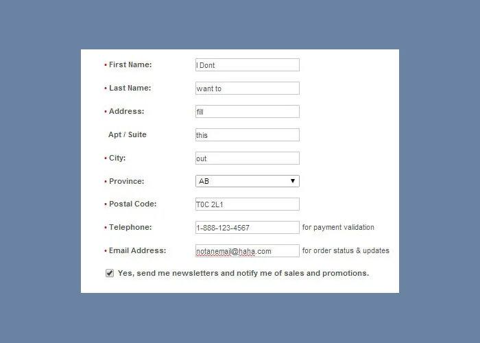
A beautiful design, right? Sarcasm aside, if your company has a registration form in which you ask for name, surnames, e-mail, phone, address, zip code and a long etc., my question to you is… do you really need to know all this data beforehand?
Moreover, a PRWeb study reveals that 88% of users lie in the information they provide on registration forms. People are reluctant to give their personal details to strangers.
With subscription and contact forms the same thing happens. Many websites ask you for so much information that it’s a real headache to fill out their forms, especially if you are browsing the website from your smartphone. If what you want is to get more conversions, I recommend you to apply the philosophy of “less is more” and that you only ask for an e-mail or a phone number.
That first step is enough to begin a relationship with your potential customers. Nowadays Social Networks make it even easier for us. You can integrate registration buttons with Google, Facebook, LinkedIn and other Social Networks so that your users can register with a single click. Once you have your contact, it is your job gain the customer’s trust little by little until you manage to close the sale.
2. Avoid distractions and get to the point
Analyze the Header and the Sidebar of your site. What do you see? Probably navigation links to the different sections of your website, a widget with a list of articles categories, an internal search widget and, with a little luck, even a Google AdSense banner.
Speaking of AdSense: If your only reason to have a Blog is to monetize it via AdSense and earn 50 USD/month, maybe it’s time for you to rethink your Online strategy. I suggest you remove AdSense right away and start promoting your own products (courses, e-books, etc.) as it will be much more profitable.
Now pay attention: any link, banner or menu that does not help to achieve a conversion… IS USELESS.
I’ll give you an example, this website does not beat about the bush:
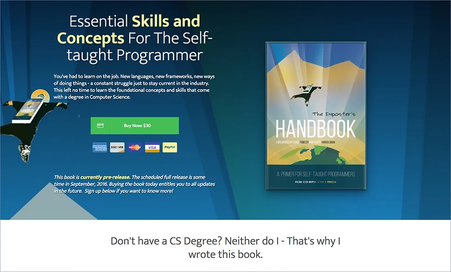
It’s worth seeing the full website here. It doesn’t have a Header or navigation and it is 100% focused on selling. It has 4 “buy now” buttons and, in case you aren’t ready to pay right away, it gives you the option to leave your e-mail to subscribe to the newsletter and contact you in the future. What do you think?
3. Change the tone of your texts (and your corporate image too)
Many of the websites that I find usually have texts similar to this:
“Our company is an Online Marketing consulting company that is born to offer complete solutions in terms of design, branding and communication for all sectors…” ::: I’m falling asleep Zzz :::
80% of the texts in corporate websites seem to have been written by a robot. In addition, all give the impression of being the same text, copied and pasted from other websites. Check out this website:
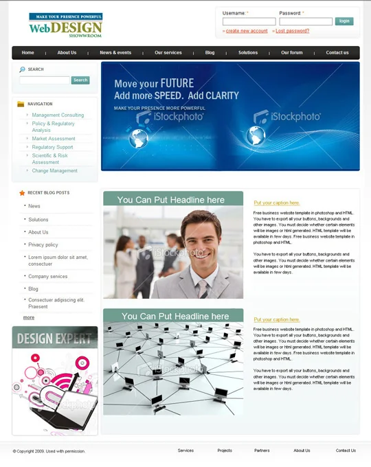
OK, it’s a template… but there are many real websites that are like that. It has all the components of a boring corporate website: top menu, side menu, links to articles, slider and stock pictures. You do not even have to read the texts to know that they haven’t been given the slightest effort in writing them.
The problem is that if you really want to get customers or sell something online you can’t have the typical Web with “about us”, “our mission and values”, “our products and services”, and so on. And just talk about your company.
To get a sale you have to focus your speech on the client, connect with him and with his emotions.
Copywriting is all an art: using written language to communicate something persuasively and getting sales is not easy. Doing it well takes a lot of practice, but you can start by communicating naturally, without technicalities and treating your reader as if you were talking to a friend.
Maybe you’re thinking “is that my sector is more serious, we have to communicate with formality…” but I tell you a secret: economists, doctors, engineers and lawyers (to name a few “serious” professions) also like to be addressed to in a friendly way :)
4. Include social proof
If your visitors trust your business they are more likely to give you their contact information and buy on your website. There are many ways to convey trust, but I will highlight three:
- Include customer endorsements. Their recommendations must be real because false recommendations can be spotted a mile away and they reduce credibility of your brand.
- Include reviews and ratings on product pages. Just like customer endorsements, they must be genuine. It’s better to receive criticism about a product and take it constructively to improve it than to put false reviews and end up with unsatisfied customers.
- Put your photo or one of your team. Have you noticed that all of our posts are signed and with a picture? The “about us” and “contact” pages can transmit more confidence if you put photos of real people than stock images taken from the Internet.
 This is me, I am a real person!
If you need anything, you can contact me on Twitter.
5. Get leads on your own website
Most visitors to your website will go away and never come back, so… why not use all the possible options to capture their contact details?
Exit intent popups are forms that emerge on the screen when the visitor is about to leave the page. They may be a bit annoying but they are super efficient at acquiring leads on your website who would otherwise be lost visitors.
FAQ
Why do single-field forms convert better?
Because people are reluctant to hand over personal data to strangers. A PRWeb study found 88% of users lie on registration forms anyway, so asking for name, address, phone, and ZIP just trains them to lie or bounce. Ask for an email or a phone number and earn the rest of the details later.
Should I really kill my sidebar and header on landing pages?
On any page whose job is to convert, yes. If a link, banner, or menu doesn’t push toward the sale, it’s dead weight. Look at landing pages built for selling: most have no header, no nav, and 3-4 buy buttons.
My industry is “serious” - can I still use conversational copy?
Yes. Lawyers, doctors, engineers and economists all prefer being addressed like humans. Corporate-template copy (“solutions for all sectors…”) puts readers to sleep regardless of industry. Write like you’d talk to a friend.
Are exit-intent popups annoying?
A bit, but they capture leads who would otherwise be gone forever. Most visitors leave and never return, so a small UX tradeoff for a real lead is usually worth it.
Key takeaways
- 88% of users lie on registration forms (PRWeb study). Ask for less, get more truth.
- Single-field forms (email or phone) convert better than multi-field forms.
- Kill the sidebar and header on conversion pages. Anything that doesn’t push to a sale is dead weight.
- Real photos beat stock photos for trust. Sign your posts and show your face.
- Exit-intent popups capture visitors who would otherwise leave forever.
- Conversational copy outsells corporate copy in every “serious” industry.
Do you need help to get more sales?
These improvements are fast to implement, but if you don’t know how to do it… don’t worry! Open a free account with MetricSpot and we’ll guide you step by step on how to improve your website: